


Modern screens come in every shape and size, from small phones to ultra-wide monitors. A layout that looks perfect on one device can break badly on another if it relies on strict pixel values. Pxless design is an approach that reduces dependence on fixed pixel sizes and instead encourages flexible, scalable layouts that adapt automatically.
In practice, Pxless design means thinking in proportions rather than exact numbers. Instead of asking “How many pixels wide should this button be?”, you start asking “How much space should this button take inside its container?” This shift helps your interface remain usable even when users zoom in, change system text size, or view your product on a new device that did not exist when you first designed it.
Why Fixed Pixels Cause So Many Problems
For many years, designers were taught to chase “pixel-perfect” layouts. That mindset made sense when most people used similar desktop screens. Today, that world no longer exists. Fixed pixel values can easily create horizontal scrolling, broken layouts, or unreadable text on small devices. A button designed at 320px wide might look fine on a laptop but overflow a mobile screen.
Fixed pixels also ignore user preferences. Many people increase their text size or zoom level for comfort or accessibility reasons. If your layout is built with rigid pixel heights and widths, content can overlap, break out of containers, or become impossible to read. Pxless design helps avoid these issues by allowing elements to grow, shrink, and reposition naturally as conditions change.
Core Principles of Pxless Design
The Pxless approach is not about banning pixels completely. Instead, it is about using them sparingly and relying more on flexible units and layout systems. You aim to keep the overall structure fluid while still using precise values where they truly matter, such as thin borders or hairline dividers.
A Pxless interface usually follows three pillars: relative sizing for elements, content-first layouts, and scalable typography with flexible spacing. When these pillars work together, you get interfaces that feel consistent and stable across different screens, while remaining comfortable for users who adjust zoom or font settings.
Using Relative Units Instead of Rigid Pixels
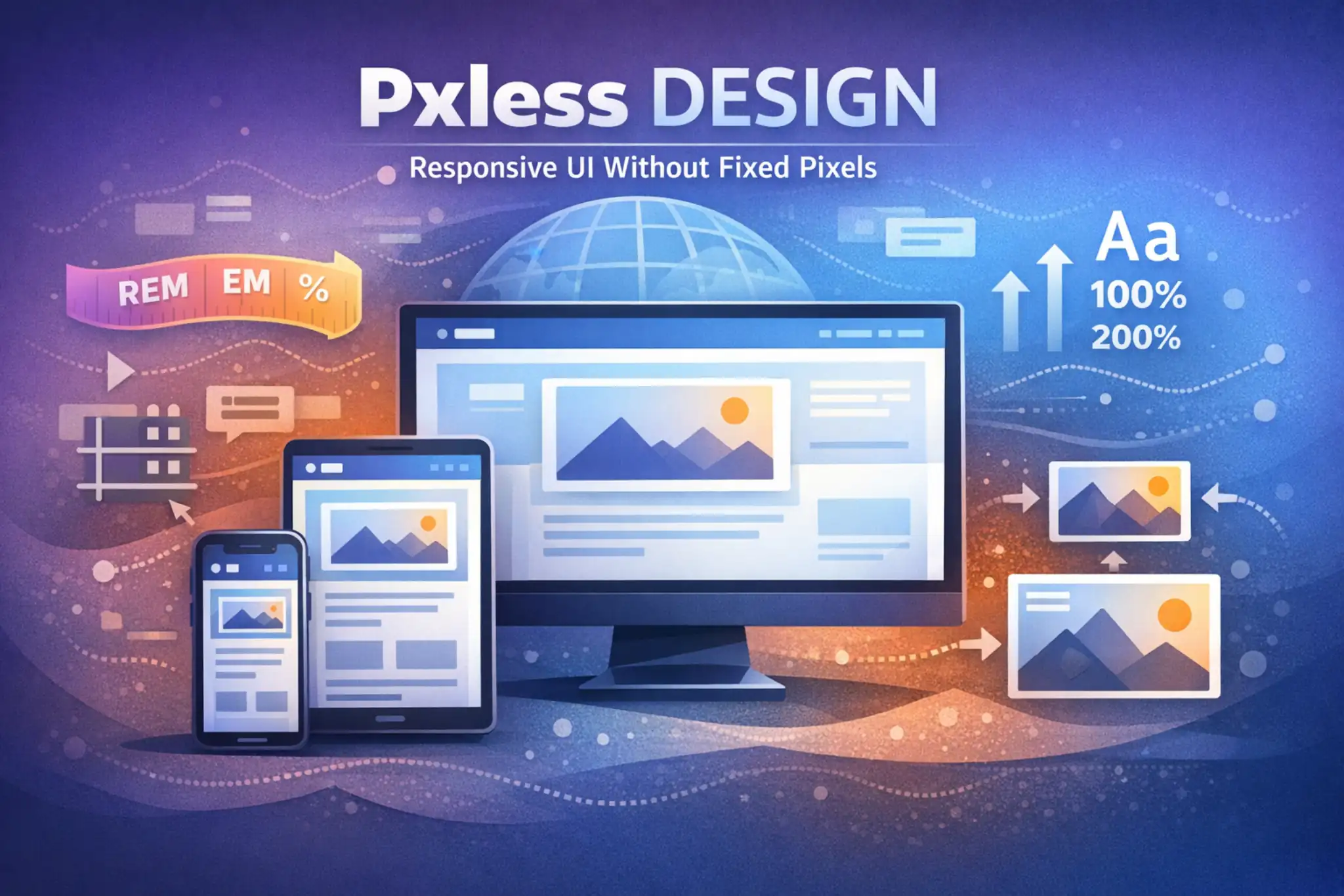
One of the most important habits in Pxless design is replacing fixed pixel values with relative units wherever possible. These units scale according to the font size, container width, or viewport size, so your design can respond naturally when something changes. You might use small pixel values for fine detail, but main layout decisions should lean on flexible measurements.
Only in this paragraph, here are some helpful relative units you can use:
-
remfor font sizes and spacing based on the root font size -
emfor sizing elements relative to their parent -
%for widths, heights, and positioning based on container size -
vwandvhfor elements that depend on the viewport dimensions
When you rely on these units, your layout stretches and shrinks in a controlled way instead of snapping or breaking at certain device widths.
Designing Content-First Layouts
Pxless design starts from the content, not from a specific device frame. Instead of designing separate static layouts for “mobile”, “tablet”, and “desktop”, you allow the content to define where changes are needed. You begin with the smallest reasonable screen, arrange the content so it is clear and readable, and then expand the viewport until the layout feels too stretched or crowded. That point becomes a natural breakpoint.
This content-first approach avoids fragile designs that depend on exact device sizes. You focus on reading experience, hierarchy, and interaction paths. Cards, forms, navigation, and text blocks are allowed to stack, stretch, or reflow based on available space. As a result, the interface feels balanced on old phones, new folding devices, large monitors, and everything in between.
Scalable Typography and Flexible Spacing
Text is at the heart of almost every interface, so a Pxless layout treats typography as a flexible system, not a fixed set of pixel values. Instead of hardcoding every line of text to fixed sizes, you use relative units that scale when the base font size changes. This approach allows users to enlarge text up to 200% without breaking the layout, which is essential for accessibility and comfort.
Spacing should follow the same philosophy. Margins, padding, and gaps between elements can be built on a scale that grows or shrinks in relation to the base text size. When text grows, so does the breathing room around it, keeping the layout readable and calm. This is very different from rigid pixel spacing, where bigger text often collides with nearby content.
Implementing Pxless Design on the Web
On the web, Pxless thinking translates directly into CSS. For structure, you can use modern layout tools such as flexbox and grid. These tools allow you to build rows and columns that change their size based on available width, so your interface can nicely adapt to narrow and wide screens. Columns can switch from side-by-side to stacked without needing a new static layout for every device.
You can also combine flexible layouts with media queries that respond to actual content needs. Instead of targeting a specific phone brand, you adjust styles when the layout looks cramped or too stretched. For example, you might introduce a breakpoint when a line of text becomes too long, or when a column of cards would benefit from adding another column.
Responsive Images and Media Without Fixed Pixels
Images and other media often cause trouble in rigid designs because they can easily be wider than the viewport. A Pxless approach avoids this by making images scale within their containers. Rather than setting fixed pixel widths, you allow images to shrink to fit smaller screens while preserving their aspect ratio. This keeps pages clean and readable without horizontal scrolling.
At the same time, you can still provide high-resolution sources for sharp displays. Techniques such as responsive images or modern source sets let browsers choose the right image version for each device. Combined with flexible containers, this gives you a layout where both media and text adapt gracefully, even when users rotate their devices or zoom in.
Pxless Thinking for Mobile and App Interfaces
Pxless design does not belong only to websites. Mobile and desktop apps also benefit from breaking away from fixed pixels. Native platforms often provide their own responsive units, such as density-independent layout values and font units that respect user settings. These units allow designers to create components that look roughly the same size on different screen densities without manual recalculation.
A Pxless app layout is built with components that stretch, shrink, and reposition themselves while preserving hierarchy. Buttons keep comfortable touch targets, text remains readable, and navigation stays clear, whether the app appears on a small budget phone or a large high-resolution tablet. This consistency improves usability and reduces the need for separate, device-specific designs.
Building Pxless Design Systems and Tokens
For larger teams, Pxless design becomes much easier when it is supported by a shared design system. Instead of sprinkling random pixel values across many files, you define tokens for spacing, typography, and component sizes that are based on relative scales. Designers and developers both reference the same system, which keeps the interface consistent even as it evolves.
These tokens can be expressed in relative units so that every component inherits Pxless behavior by default. A card component, for example, might use spacing tokens that scale with the base font size. When you change the base scale for a new product or theme, the entire system updates in a predictable way without needing to edit each screen by hand.
Accessibility and Performance Benefits
Pxless design naturally supports people who adjust text size or zoom levels because layouts remain flexible instead of breaking. Users with low vision, those who hold screens very close, and those who prefer larger fonts all benefit from interfaces that can stretch without overflowing or hiding content. This respect for user control supports more inclusive experiences.
There are also performance advantages. When you avoid duplicating layouts for many device sizes and instead rely on reusable flexible components, you reduce maintenance overhead. Fewer special cases and overrides simplify both design files and code. That can lead to cleaner stylesheets, fewer layout bugs, and smoother long-term improvements.
Collaboration and Handoff With Pxless in Mind
When designers and developers share a Pxless mindset, handoff becomes simpler. Instead of specifying every element in fixed pixels, design files communicate rules: minimum and maximum widths, flexible columns, scalable text, and how components behave when space is constrained. These rules translate well into modern layout techniques in code.
Developers can then implement components that match the intent rather than chasing a fragile static layout. Changes to content are less likely to cause unexpected breaks because the system was built to move. Over time, this reduces friction between teams and makes it easier to iterate on the interface without rebuilding everything for each new device or screen size.
Common Mistakes to Avoid in Pxless Design
The biggest trap for teams adopting Pxless principles is going halfway. It is common to switch font sizes to relative units but leave containers and spacing in fixed pixels. In that situation, text grows while the boxes around it do not, leading to overlapping content and broken cards. To avoid this, you should treat typography, spacing, and layout as one flexible system.
Another mistake is assuming Pxless means ignoring visual precision. In reality, you can still create clear, intentional layouts, but you do so with ratios and scales instead of a wall of fixed numbers. You can use pixels for delicate parts like borders or icons while relying on relative units for overall structure. The goal is balance, not chaos.
Final Thoughts
Screens, devices, and user expectations will keep changing. Layouts built tightly around today’s common resolutions can feel outdated or brittle in just a few years. Pxless design is a way to make your interfaces more resilient by basing them on relationships and proportions instead of fixed pixel counts. It respects user control, supports accessibility, and adapts more gracefully to new environments.
By embracing relative units, content-first layouts, scalable typography, and responsive components, you create digital experiences that feel natural on almost any device. Pxless design does not throw away precision; it redirects it toward what matters most: readable content, clear hierarchy, comfortable interaction, and an interface that survives the next generation of screens without a complete redesign.
Frequently Asked Questions (FAQs)
What does Pxless design actually mean?
Pxless design means creating user interfaces that do not depend heavily on fixed pixel values, using flexible units and layouts so the design can adapt to different screens and zoom levels.
Does Pxless design still use pixels anywhere?
Yes, pixels are still useful for fine details such as borders or thin lines, but the main layout, typography, and spacing are controlled by relative units that can scale.
How is Pxless design different from pixel-perfect design?
Pixel-perfect design aims to fix every element to exact sizes, while Pxless design focuses on scalable structures that keep the layout consistent even when devices or user settings change.
Is Pxless design the same as responsive design?
Pxless design is closely related to responsive design, but it places special focus on avoiding rigid pixel values and building flexibility into typography, spacing, and components from the start.
Why is Pxless design better for accessibility?
Because it relies on relative units, Pxless design allows text and layouts to resize cleanly when users increase font size or zoom, which helps people who need larger or clearer content.
Can I use Pxless principles in existing projects?
Yes, you can gradually refactor existing interfaces by converting fixed pixel values into relative units, updating spacing scales, and moving to flexible layouts such as grid or flexbox.
Does Pxless design help with future devices?
Pxless layouts depend on proportions and content behavior rather than specific devices, so they tend to adapt better when new screen sizes or form factors appear.
How do I start designing with Pxless in my tools?
Begin by setting a clear base text size, define a simple spacing scale using relative units, and build components that stretch or stack instead of using fixed pixel dimensions.
Is Pxless design only for web interfaces?
No, Pxless ideas apply to mobile apps, desktop software, and any digital interface where content and components must work across different display sizes and densities.
Will Pxless design make my layouts look less precise?
A Pxless layout can still be very precise; the difference is that your precision comes from consistent ratios, scales, and rules instead of a long list of fixed pixel measurements.
How does Pxless design affect collaboration between designers and developers?
It encourages both sides to talk in terms of behavior and rules, which makes it easier to translate designs into code and reduces conflicts when content or screen sizes change.
Do I need a full design system to use Pxless ideas?
A design system helps, but it is not required; you can start small by applying Pxless principles to typography, spacing, and a few core components, then grow from there as your product evolves.
FOR MORE : INSIDE FAME