


A colour that looks vivid and balanced on screen can become dull, muddy or unexpectedly bright when applied to packaging, fabric or printed material. Digital design palettes offer speed and flexibility, but screens produce colour with light while physical products depend on inks, dyes, coatings and surface texture. Even the emotions associated with a shade can shift when its appearance changes, which makes an understanding of colour psychology in UX useful beyond the screen. For consistent tangible products, colour choices need a physical workflow from the start.
The Gamut Compression Trap
A monitor can display bright colours that many printing and manufacturing processes cannot reproduce. When a saturated RGB shade moves into a smaller colour space, software has to pull it towards the nearest available result. This gamut compression can weaken vivid greens, intense blues and fluorescent-looking tones.
The change may seem minor on screen, especially when a bright monitor compensates for lost saturation. On a printed box or painted component, it becomes much clearer. Check your design software’s gamut warnings early and avoid treating a screen preview as proof of production colour. If a particular shade carries strong brand recognition, identify a physical reference before approving the full palette.
Bridging Digital Codes to Pigment
Hex and RGB codes describe colour for illuminated displays. They don’t provide a universal recipe for ink, paint, plastic or textile dye, so sending a digital code to a supplier leaves room for interpretation. Material choice also affects the outcome. The same pigment can appear warmer on uncoated paper and cooler on glossy stock. These considerations also shape how brands use colours, materials and finishes to create effective product packaging.
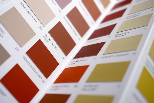
Translate key colours into an established physical colour system and record both the reference and intended material. Designers and production teams looking for colour charts, guides or measurement equipment can click to visit SHOP21 when assembling this part of their workflow. Keep the approved physical sample with the project file, then ask each supplier to match that reference instead of relying on a screen capture.
Evaluate Samples Under Controlled Light
Always review samples under consistent lighting. Daylight changes throughout the day, while office bulbs may add a yellow, green or blue cast. A product can match perfectly beside a window at noon yet look noticeably different under retail lighting.
Use a neutral viewing area with controlled illumination and compare the sample against your approved colour reference. Check it under at least two relevant conditions, such as simulated daylight and the lighting used in shops or offices. This helps reveal metamerism, where two colours match under one light source but separate under another. Guidance on online colour variation also explains why device settings and display technology can create misleading expectations before sampling begins.
Document each review with the light source, material, finish and sample date.
Set Realistic Production Tolerances
Perfect colour matching across every material and production run may be technically impossible. Paper absorbs ink, plastics contain different base tones and fabrics reflect light through their fibres. A practical specification defines how much variation is acceptable before production starts.
Agree measurable tolerances with your supplier and ask how they check them. For a small run, visual approval against a physical standard may be enough. High-volume packaging or products made by several factories may require readings from a calibrated spectrophotometer. You should also define which element takes priority if colour, texture and finish cannot all match the original concept exactly.
Approve a representative production sample, label it clearly and store it away from heat and direct sunlight. That retained sample gives future suppliers a concrete benchmark and prevents a digital file from becoming the only record of the intended colour.
